Does the shape of a letter influence how children learn? Yes—and often more than adults expect. Typography in educational content for children does more than fill space. It guides young eyes, supports early literacy, and subtly shapes comprehension.
Why Typography Matters in Learning Environments
Children engage with text before they can read fluently. Fonts act as visual cues, helping them distinguish shapes, associate meaning, and build familiarity with written language. The typeface sets the tone for how they perceive the material.
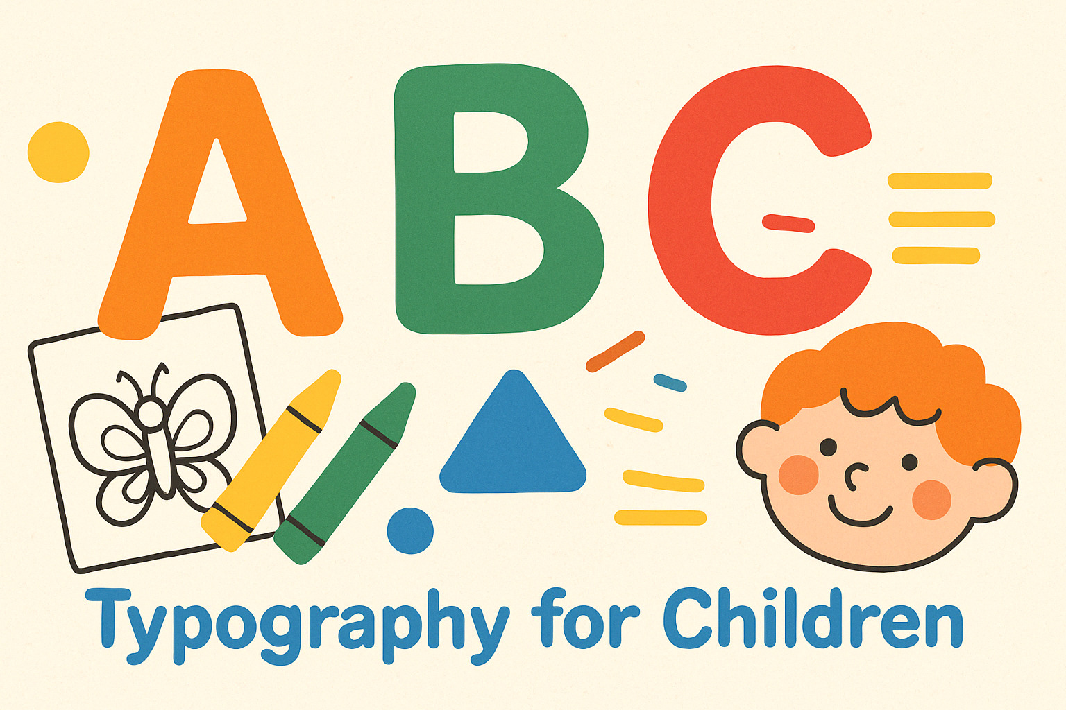
Clear, well-designed fonts promote easier decoding of words. Rounded characters, generous spacing, and distinct letterforms support recognition and reduce cognitive load.
Font Characteristics That Support Young Learners
The design choices behind child-friendly fonts are grounded in practical readability. Fonts used in early education are often:
- Sans-serif: Smooth, clean strokes help avoid distractions.
- Open and round: Characters like “a,” “e,” and “g” benefit from clarity and openness.
- Consistent strokes: Fonts without excessive variation keep reading fluid.
- Large x-heights: Taller lowercase letters improve legibility.
Here’s what to consider when selecting fonts for children’s materials:
- Letter differentiation
Fonts should clearly distinguish between characters like lowercase “l,” uppercase “I,” and the number “1.” Confusion here can stall reading development. - Spacing and kerning
Proper distance between letters helps children isolate each character. Overly tight fonts cause letters to blend, while too much space breaks word structure. - Stroke simplicity
Avoid ornate fonts. Swashes, curls, or unnecessary decorations can complicate reading and distract from learning goals.
Fonts in Action: How Typography Impacts Learning
Visual learning relies on the balance between clarity and engagement. Typography sits at this intersection. A playful yet legible font can hold attention while reinforcing letter recognition. In contrast, poorly chosen fonts can deter interest or misguide the eye.
Educational materials—workbooks, activity sheets, early readers—benefit from fonts that match both age and skill level. For beginning readers, every distraction removed is a step toward fluent reading.
Research consistently shows that font choice affects comprehension and engagement in educational materials. When the typography aligns with the developmental stage of the learner, information retention increases, and frustration decreases.
Designing for Multisensory Learning
Visuals are only part of the equation. In learning settings that combine color, movement, and interaction, typography still matters. Whether it’s in interactive whiteboards, digital learning apps, or printable coloring pages, the font must carry its weight without overpowering the visual environment.
Balanced typography complements images and icons without stealing focus. The best fonts feel invisible in use—letting the message take priority while still maintaining a subtle structure.
Fonts That Support Storytelling and Play
Storybooks and activity guides often blend entertainment with learning. Fonts here must do double duty: hold attention and stay readable.
Here are a few strategies:
- Use informal, rounded fonts for early-grade storybooks and hands-on materials.
- Mix bold and regular weights to emphasize key words or instructions.
- Introduce all-caps sparingly, only for headers or simple labeling tasks.
Takeaway: Design with the Reader in Mind
The right font bridges the gap between content and comprehension. For children, this means guiding young minds toward understanding without interference. Every curve, line, and space within a font carries meaning—and that meaning has the power to support learning from the first letter onward.