Opening
Choosing the right fonts for your brand is more than picking something that looks nice. It is about shaping how people perceive your business, trust your message, and remember your name. The font you choose becomes part of your brand’s personality and helps tell your story in every touchpoint – from your website to packaging to social posts. At FontsDownload.org, you will find typography resources, curated font pairings, and design education that can guide you from first sketch to a polished brand system. This guide will walk you through practical steps, essential concepts, and actionable tips to help you select fonts that reinforce your brand identity and improve readability.
Understanding Brand Identity Before Fonts
Before you ever click a font repository, take a moment to map your brand identity. Fonts will amplify who you are, but they must align with your core values and audience expectations.
- Define your brand personality
- Is your brand friendly and approachable or premium and authoritative?
- Do you want to feel energetic and bold or calm and trustworthy?
- Clarify your brand voice
- What would your brand sound like if it spoke aloud?
- Is your messaging formal, conversational, witty, or concise?
- Know your audience and context
- What are their reading habits and accessibility needs?
- In what environments will your typography appear (print, mobile, signage, packaging)?
A clear brand brief acts as a north star for font decisions. It helps you avoid chasing fads and instead build a typography system that endures. At Font sDownload.org you can explore articles and resources that teach you how to translate identity into typography, but the core work starts with a solid brand definition.
What your brand identity tells you about fonts
- If your brand is classic and trustworthy, serif fonts can communicate that heritage.
- If your brand is modern and clean, sans serif fonts often feel current and legible.
- If your brand aims to be bold and energetic, display or slab fonts can grab attention.
- If your brand wants a personal touch, script or handwritten styles may convey warmth or craft.
The Core Font Classifications and Their Personalities
Understanding font families helps you choose with intention. Each classification has a mood and a practical role in branding and readability.
Serif fonts
- Mood: traditional, reputable, trustworthy
- Best for: long-form reading, formal communications, luxury branding
- Typical uses: body copy in print, formal headlines, editorial branding
- Considerations: ensure good readability at small sizes; pairing with a sans serif for headings can provide contrast
Sans serif fonts
- Mood: modern, clean, accessible
- Best for: digital interfaces, brands that want a contemporary feel
- Typical uses: UI text, website body copy, signage
- Considerations: great for accessibility; many font families offer wide language support and characters
Slab serif fonts
- Mood: strong, confident, impactful
- Best for: bold branding, headlines, emphatic statements
- Typical uses: logo marks, display headlines, packaging
- Considerations: pair with a lighter sans serif or a refined script to avoid heaviness
Script fonts
- Mood: elegant, handwritten, personal
- Best for: invitations, luxury branding, fashion, craft aesthetics
- Typical uses: accents, signatures, logotypes
- Considerations: readability is the limiting factor; use sparingly for short phrases and high contrast with body text
Decorative fonts
- Mood: distinctive, playful, distinctive
- Best for: branding that needs a strong visual fingerprint
- Typical uses: logos, display headlines, packaging
- Considerations: limit use to headlines or logo marks; ensure legibility at intended sizes
Handwritten fonts
- Mood: friendly, human, informal
- Best for: personal brands, creatives, small business branding
- Typical uses: blog headings, captions, product packaging
- Considerations: contrast with body text; avoid excessive variability that harms readability
Important note on font selection
The most effective branding uses a small, purposeful set of fonts rather than many. A typical brand font system includes:
– One primary font for headlines and emphasis
– One secondary font for body text and longer reading
– A display or accent font for logos and special UI elements
The goal is clarity, consistency, and a clear hierarchy across all channels.
How to Choose Fonts for Branding: Process
A thoughtful process helps you select fonts that fit your brand and perform well in real life.
Step 1: Audit your brand and competitors
- List three to five adjectives that describe your brand
- Identify three competitors and the fonts they use
- Note where typography helps or hinders their messaging
- Decide where you need emphasis (headlines, logos, captions)
This audit informs your font direction and helps you avoid blending in with the crowd.
Step 2: Pick a primary font and a secondary font
- Primary font: choose a typeface with strong personality that supports your brand voice
- Secondary font: select a font that complements the primary in terms of x-height, contrast, and legibility
- Establish a visual harmony by ensuring the two fonts share common traits (x-height, letter width, and stroke width)
This pairing approach creates a cohesive look while enabling a clear hierarchy.
Step 3: Consider readability and accessibility
- Ensure sufficient contrast between text and background
- Favor font families with good language coverage and diacritics
- Check legibility at small sizes for body text on screens
- Use accessible font weights to convey emphasis without relying on color alone
Tools that help with accessibility checks are widely available; search for contrast checkers and WCAG guidelines as you test your chosen fonts.
Step 4: Test across touchpoints
- Web: typography on desktop and mobile, responsive text, and line length
- Print: logos, headlines, body copy on business cards, brochures
- Social: legibility in small thumbnails and post images
- Branding materials: signage, packaging, email signatures
Testing ensures your fonts perform consistently in real world usage.
Font Pairing Principles that Work
Pairing fonts well is an art informed by a few reliable rules. Here are practical guidelines you can apply.
Contrast and balance
- Use a high contrast between your primary and secondary fonts to establish a clear hierarchy
- Avoid clashes in x-height and overall letter width; mismatch can feel unsettled
Similarity and diversity
- Pair fonts with similar proportions or a shared design language (for example both are geometric sans serifs)
- Introduce a contrasting style for emphasis or logo marks to create a memorable focal point
Flexibility and reuse
- Ensure your pair works at headings, subheads, body text, and UI elements
- Test weights and italic variants to maximize usability without clutter
Templates you can start with
- Serif body text with sans serif headings
- Sans serif body text with a display serif for headlines
- Slab serif headlines with a clean sans serif body copy
Real world examples to study
- A luxury brand might use a refined serif for body text combined with a bold display sans for headlines
- A tech startup could pair a geometric sans with a rounded humanist sans for a friendly yet modern look
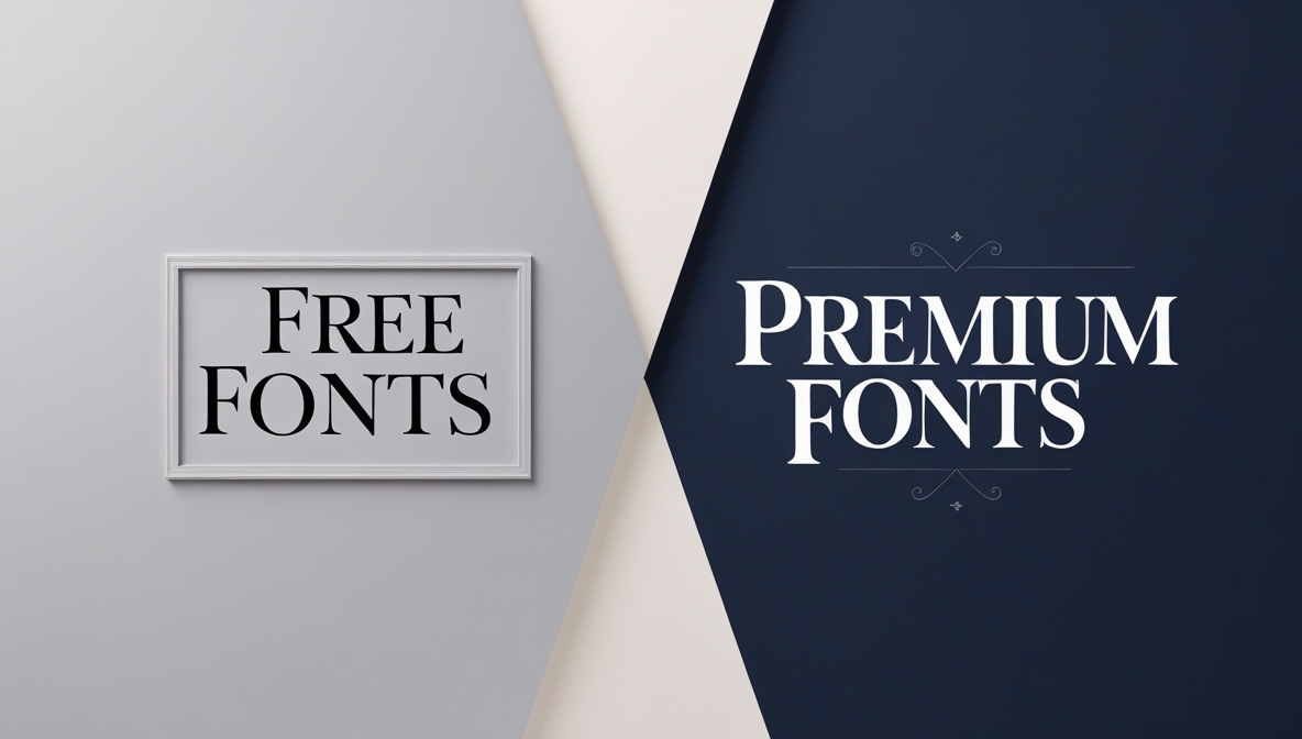
Free vs Paid Fonts: What to Know
Choosing between free and paid fonts depends on your project scope, licensing needs, and long term plans.
Pros and cons
- Free fonts:
- Pros: quick access, no upfront licensing cost, broad distribution
- Cons: limited family variety, sometimes inconsistent quality, licensing can be murky
- Paid fonts:
- Pros: larger font families, professional design, explicit licenses for web and print
- Cons: upfront cost, usage rules to manage
How to evaluate fonts on FontsDownload.org
- Look for families with multiple weights and styles
- Check for language coverage and diacritics
- Prioritize licenses that cover web usage and print production
- Read design notes and pairing suggestions that accompany each font
- Explore font pairings curated by the site to jumpstart your choices
Font licensing is the backbone of a sustainable brand. A font you license today should scale with your brand as it grows and expands into new channels.
Building a Typography System for your Brand
A typography system is the set of rules that governs how type is used across all brand assets. It ensures consistency, speeds production, and strengthens recognition.
Typography hierarchy
- Headline 1, Headline 2, Headline 3
- Subheads
- Body text
- Captions and microcopy
- UI labels and buttons
- Logo logotypes and wordmarks
Define font sizes, weights, line heights, and letter spacing for each level. Document these values in a brand style guide so anyone on your team can apply them correctly.
Brand style guide essentials
- Typeface choices and usage rules
- Color, contrast, and accessibility standards
- Spacing, alignment, and grid rules
- Example applications: website pages, business cards, packaging
- Do and don’t examples to avoid common missteps
A concise and practical style guide helps prevent typography drift and preserves brand integrity.
Tools and Resources for Font Discovery
Leverage resources that help you discover, test, and pair fonts confidently.
Font discovery and experimentation
- Explore font families with multiple weights and styles
- Try pairing suggestions that fit your brand personality
- Preview your typography in real design contexts, such as mock website pages or app screens
Practical tips when using FontsDownload.org
- Use the site to find typography resources and design education tailored to branding
- Look for curated font pairings that you can adapt to your project
- Save and export font combinations for quick reference in your design workflow
Remember to test any chosen fonts in real materials and across devices to ensure your brand message reads consistently.
Case Studies and Real World Examples
Observing how other brands use typography can illuminate what works and what to avoid. Here are some guiding patterns you might see in successful branding.
Brand fonts that strengthened identity
- A premium fashion label using a refined serif for print and a clean sans for digital assets communicates elegance and modernity
- A startup technology brand pairing an approachable sans with a distinctive display font creates a friendly yet cutting edge impression
- A small business using a handwriting style for product labels paired with a neutral body font helps convey authenticity
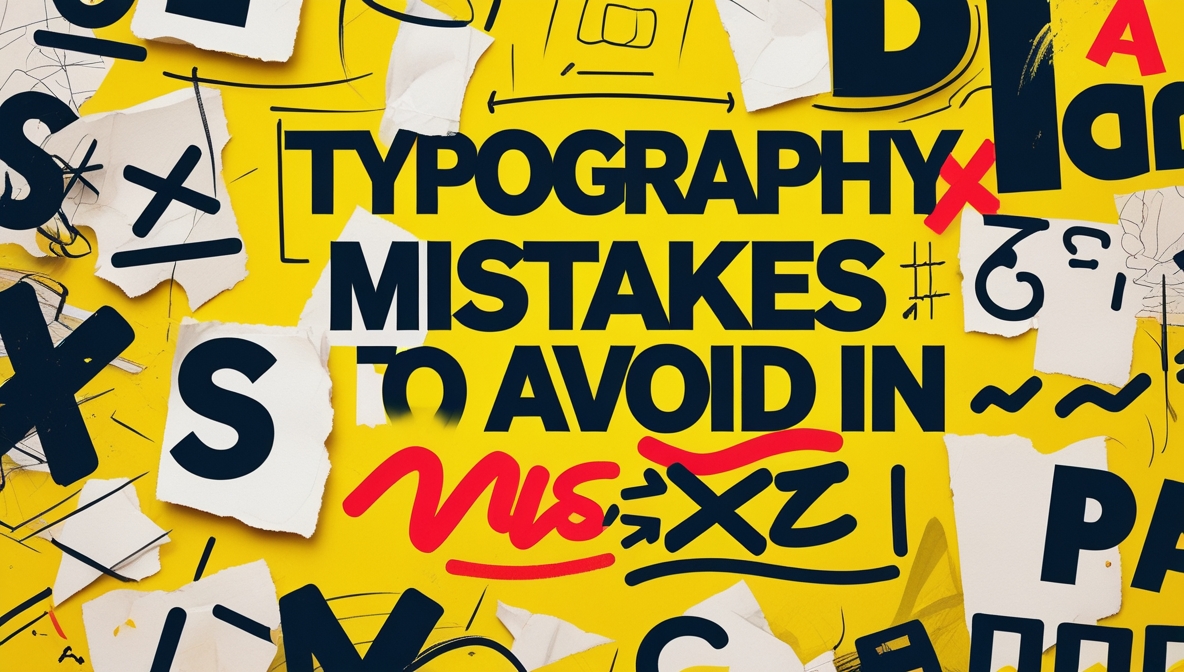
Common pitfalls to avoid
- Overcomplicating with too many font families
- Using fonts with poor web or print performance
- Ignoring accessibility and contrast guidelines
- Letting brand voice drift away from typography choices
By studying examples you can learn to avoid these missteps and choose fonts that reinforce your identity.
Practical Tips for Getting Started Today
- Start with a short list of 2 to 4 candidate fonts that align with your brand personality
- Create a simple mood board that shows how the fonts would look in headlines, body text, and logo marks
- Draft sample layouts for a website hero, a blog post, and a product label to test legibility and tone
- Check licensing early to ensure your chosen fonts can be used across all intended channels
- Visit FontsDownload.org for curated pairings and design education that can help you refine choices
Conclusion and Next Steps
Choosing fonts for branding is a blend of art and science. It requires a clear understanding of your brand identity, a disciplined approach to typography, and practical testing across real-world materials. By defining your brand voice, learning the strengths and limitations of different font classes, and following a structured pairing and testing process, you can build a typography system that feels authentic, legible, and scalable. FontsDownload.org offers a wealth of typography resources, font pairings, and design education to support you through this journey.
If you are ready to begin, here are the next steps:
- Write a brief that captures your brand personality and audience needs
- Select one primary font and one secondary font from two different classifications
- Test your pairing in at least three contexts: web, print, and social media
- Create a short brand style guide with typography rules and examples
- Explore fonts on FontsDownload.org for pairing ideas and educational content
By following these steps, you will develop a cohesive typography system that enhances your brand’s presence and resonates with your audience.