Typography is the heart of how a brand speaks without saying a word. In 2025 and moving into 2026, designers are balancing bold experimentation with legibility, accessibility, and cross cultural storytelling. At FontsDownload.org we live at the crossroads of typography resources, font pairings, and design education. This guide brings together the most relevant trends for forward thinking designers, with actionable tips you can apply today to elevate your branding, web interfaces, and print work.
What makes typography trends matter
Typography trends are not fashion for fonts alone. They reflect how audiences read, engage with content, and perceive a brand’s values. Trends influence readability, tone, and memory recall. They also shape how teams collaborate by establishing common language around type choices, layout systems, and accessibility standards. Understanding trends helps you:
- Create cohesive brand stories across platforms
- Build flexible systems that scale with content
- Maintain accessibility without compromising personality
- Stay inspired while developing font pairings that feel fresh
In this article you will find practical guidance, concrete examples, and resources from FontsDownload.org to test and apply trends in your own projects.
Trend 1: Variable fonts unlock flexible design
Why variable fonts are critical now
Variable fonts allow a single font file to deliver multiple weights, widths, and optical variants. This capability reduces file size, speeds up loading, and enables responsive typography that adapts to device context. It also opens doors for expressive typography without overwhelming the design system.
How to apply variable fonts in branding
- Build a typographic system with a narrow set of axis values (weight, width, slant) to cover headings, body text, and display accents.
- Use axis variation to emphasize hierarchy on long-form content versus quick reads on mobile.
- Pair a variable sans with a variable serif for contrast that remains cohesive.
Practical tips
1) Start with a preferred font family that offers a robust axis range. 2) Define breakpoints where axis values shift slightly to optimize legibility. 3) Test across screens and reading contexts to ensure consistency.
Trend 2: Human centered type and warm letterforms
What does “human centered” mean in typography
Human centered type prioritizes warmth, approachability, and readability. It favors letterforms with friendly curves, open apertures, and balanced contrast. Designers use these traits to create trust and accessibility, especially for brands targeting broad audiences or inclusive experiences.
When to choose human centered type
- Brand storytelling with a welcoming tone
- Educational or community focused platforms
- Interfaces that require smooth reading at small sizes
How to implement
- Start with a modern humanist sans or a soft serif for body copy.
- Use slightly rounded terminals to soften headlines without sacrificing legibility.
- Pair with generous leading and ample white space to allow breathing room.
Trend 3: Bold expressive type and kinetic typography
Why bold expression matters
Bold, expressive type commands attention and can convey personality quickly. Kinetic typography adds motion that guides the reader and enhances storytelling, especially in video, web hero sections, and social media.
Best practices for bold display
- Limit bold display to 1-2 typefaces per project to avoid visual chaos.
- Use large sizes and ample line height to maintain readability.
- Employ color and texture in combination with bold type to reinforce mood.
Motion ready guidelines
- Keep motion subtle and purposeful rather than flashy.
- Animate only essential changes such as weight or scale for headlines.
- Ensure text remains legible during motion and does not rely on color alone for readability.
Trend 4: Minimalist type with maximal clarity
Why this trend endures
Minimalist typography emphasizes clarity, legibility, and hierarchy. It works across brands that want confidence, trust, and sophistication without clutter. This is especially important for digital experiences where visitors skim content quickly.
How to execute minimalist typography
- Choose clear geometric or humanist typefaces with open counters.
- Favor neutral color palettes with strong contrast for readability.
- Develop a predictable typographic system with few weights and sizes.
Accessibility note
A minimalist approach helps with color contrast, line spacing, and readability for diverse readers including those with visual impairments.
Trend 5: Cross cultural typography and multilingual design
The global audience reality
Brands increasingly serve multilingual audiences. Typography must support multiple scripts while maintaining brand voice. Cross cultural type involves careful selection of fonts that harmonize Latin, Cyrillic, Arabic, Devanagari, Chinese, and other scripts.
Guidelines for cross cultural typography
- Use font families with reliable multilingual support.
- Preserve visual rhythm when pairing scripts by aligning x heights or maintaining similar optical sizes where possible.
- Consider cultural associations of letterforms and avoid stereotypes.
Practical tips
- Create a shared typographic scale that respects each script’s legibility constraints.
- Test type at real content in each language to confirm spacing and punctuation behavior.
- Document font fallbacks for each language to ensure consistent rendering.
Trend 6: Serif renaissance for brands
Why serifs are rising
Modern serifs blend traditional elegance with contemporary smoothing and high legibility on digital screens. Serif revival supports brands seeking credibility, luxury, or classic storytelling without appearing old fashioned.
Ways to use modern serif in branding
- Use a strong display serif for logos and headlines.
- Pair with a clean sans for body copy to maintain readability on the web.
- Experiment with variable serif options to morph weight and contrast across contexts.
Key considerations
- Choose serifs with robust hinting and legibility at small sizes.
- Consider the mood you want (formal, friendly, quirky) and pick a serif family with variants that match it.
Trend 7: Texture and tactile type in print and packaging
The appeal of texture
Texture adds depth and a tactile sense to typography, especially in print and packaging. Halftone patterns, subtle grain, and embossing can create a premium feel and increase memorability.
How to integrate texture without compromising readability
- Apply texture sparingly to display elements like headlines or covers.
- Keep body text clean and high contrast to ensure legibility.
- Use texture as a design accent rather than the main driver of typography.
Digital texture strategies
- Subtle texture simulations can be implemented with background textures behind large display type.
- Avoid heavy textures that reduce screen legibility or slow down page load times.
Trend 8: Generative typography and AI assisted design
Why generative typography matters
Generative approaches use algorithms to generate font variations, layouts, or letterforms. This can spark creativity, enable unique branding, and assist in rapid exploration of type systems.
Responsible use of AI in typography
- Use AI as a co creative tool rather than a replacement for design judgment.
- Maintain brand consistency by constraining generated results with a style guide.
- Always review generated fonts for accessibility, kerning quality, and legibility.
Practical steps
- Create a rubric for AI generated variations to evaluate weight, width, and contrast.
- Combine AI generated options with human curated selections for final choices.
- Document AI produced designs in a design system so they remain consistent across projects.
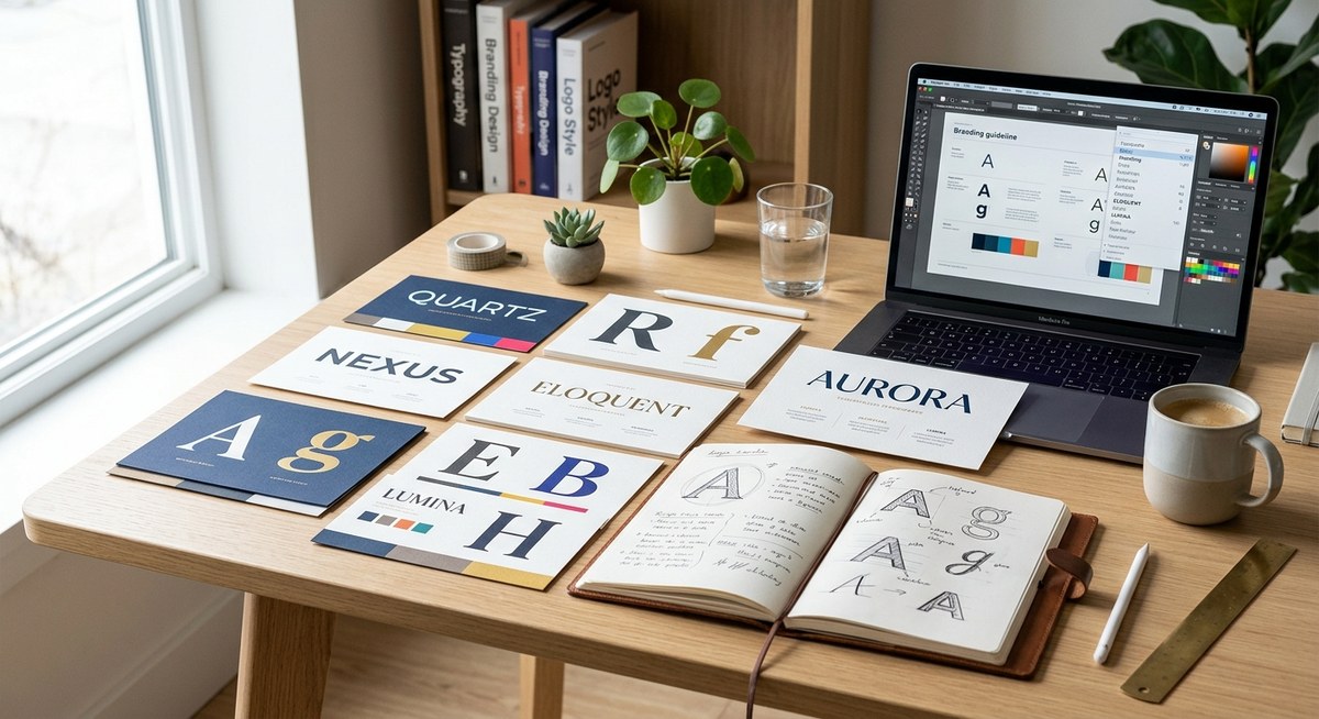
Trend 9: Thoughtful font pairings and scalable systems
The art of pairing
Font pairings create a visual dialogue. The aim is contrast that is clear but not jarring. A good pairing supports reading flow, reinforces hierarchy, and reflects brand personality.
Rules of thumb for pairing
- Pair a distinctive display type with a readable body copy font.
- Keep the number of fonts to two or three maximum for cohesion.
- Align optical sizes so that both fonts feel balanced at different sizes.
Pairing templates you can adapt
- Sans display + humanist sans body
- Serif display + geometric sans body
- Slab display + clean sans body
- Script display used sparingly for accents with a neutral body font
Trend 10: Accessibility and inclusive typography
Why accessibility is essential
Typography must be inclusive. This means legibility for readers with low vision, dyslexia friendly settings, and high contrast to support readability in varied environments.
Practical accessibility tips
- Use fonts with clear letter shapes and open counters to aid recognition.
- Favor larger default font sizes and adjustable controls on digital interfaces.
- Ensure sufficient color contrast ratios for text and background.
- Avoid relying solely on color to convey meaning or structure.
- Consider dyslexia friendly fonts or settings for body text when appropriate.
How to evaluate trends for your brand
1) Start with your brand personality: which trend aligns with your voice and audience?
2) Consider the medium: web, print, packaging, or all of the above.
3) Test with real content: check reading flow, line length, and breakpoints.
4) Test for accessibility: contrast, font size, keyboard navigation, and screen reader compatibility.
5) Build a typographic system: define 2-3 primary fonts and 1-2 fallbacks, with an axis plan for weight and width.
6) Do a competitive analysis: review how competitors and industry leaders apply similar trends, then differentiate with thoughtful pairing.
7) Iterate: collect feedback from users, editors, and developers, then refine.
Tools and resources available at FontsDownload.org
- Font pairings: Curated bundles and suggested pairings based on mood, function, and audience.
- Design education: Tutorials, explanations of typographic concepts, and practical guidelines for applying trends.
- Accessibility resources: Guides on contrast, legibility, and inclusive typography practices.
- Project templates: Starter layouts, headlines, and body text scales that work across digital and print.
- Community insights: Case studies and design notes from fellow designers to spark ideas and avoid common pitfalls.
Real world applications and case studies
- Brand website hero typography that uses a variable font to adjust weight across devices while preserving a strong headline.
- A packaging system that uses a serif headline to convey premium quality with a clean sans body for legibility on shelves.
- An e commerce product page that combines cross cultural typography for global markets with accessible color contrast and scalable type.
- A mobile app onboarding flow that relies on kinetic typography to guide users through steps without overwhelming them.
- A print brochure using texture on large display type to add tactile interest while keeping body text legible.
Frequently asked questions
What are the top typography trends for 2025 and 2026?
The most impactful trends include variable fonts for flexibility, human centered and warm letterforms for approachability, bold and expressive display typography for emphasis, minimalist clarity for readability, cross cultural typography for global reach, serif renaissance for credibility, texture in print and packaging for tactility, generative typography for creative exploration, thoughtful font pairings for structure, and a strong focus on accessibility.
How can AI influence typography without compromising quality?
AI can accelerate exploration of font variations and layout ideas. Use it to generate options and then apply human judgment to ensure brand alignment, legibility, and accessibility. Always verify the output on real devices and with assistive technologies.
Which fonts work best for branding in 2026?
There is no one size fits all. The best fonts depend on brand personality and audience. However, modern sans serifs for clean systems, versatile serifs for credibility, and display fonts with distinctive character for headlines are common, while ensuring good legibility and robust multilingual support.
How do I start integrating these trends in a small business project?
- Define your brand voice and audience.
- Choose two fonts with good readability across devices.
- Build a simple typographic scale with sizes that map to sections and content blocks.
- Test across pages and devices, ensuring accessibility standards are met.
- Update your brand guidelines to reflect the chosen trends so future work stays consistent.
Additional ideas you can try this quarter
- Create a mini typography kit for your team that includes font pairings, an axis plan for variable fonts, and a responsive type scale.
- Run a small A B test on a landing page using a variable font in the hero and a different body font on the secondary content block.
- Produce a printable style guide for internal teams that demonstrates how to apply texture, color contrast, and typographic hierarchy.
- Explore cross cultural typography by testing the same messaging in two languages using aligned font families and shared typographic rhythm.
Conclusion
Typography trends are not just about looking modern. They are about building a cohesive visual language that communicates clearly, respects diverse audiences, and remains flexible across formats. By embracing variable fonts, human centered forms, bold display, minimalist clarity, cross cultural sensibilities, serif revitalization, textured finishes, generative design, precise font pairings, and steadfast accessibility, designers can craft typography that supports meaningful experiences.
At FontsDownload.org we aim to be your trusted partner in this journey. Explore our resources for font pairings, design education, and practical guidance that helps you apply trends thoughtfully and effectively. Whether you are designing a brand identity, a website, or a printed campaign, the right typography can tell your story with confidence and clarity.