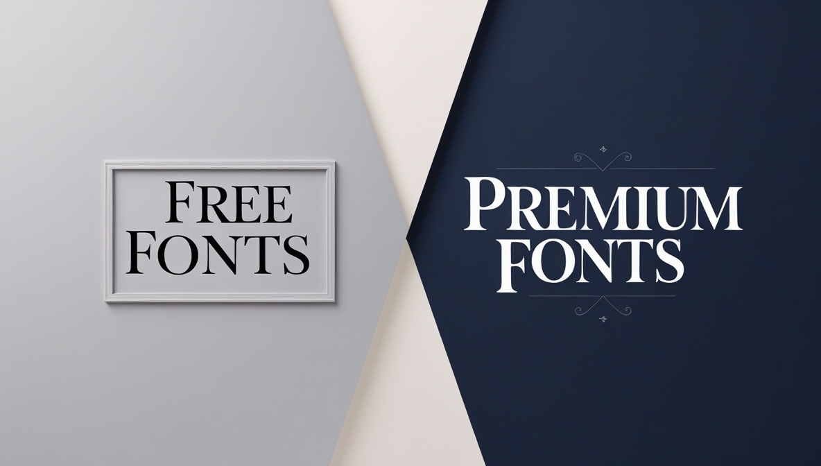
Choosing the right font can make or break your design. But when should you stick to free fonts, and when is it worth investing in a premium typeface? The answer lies in understanding your project’s scope, audience, and long-term goals. Let’s dive into the world of fonts to help you make an informed decision.
The Appeal of Free Fonts
Free fonts are a designer’s best friend, especially when working on personal projects, tight budgets, or quick turnarounds. Here’s why they’re so popular:
- Cost-Effective: Free fonts eliminate the financial burden, making them ideal for startups, students, or hobbyists.
- Accessibility: Platforms like Google Fonts, DaFont, and Font Squirrel offer thousands of free options.
- Quick Solutions: Need a font for a one-time project? Free fonts are often sufficient for short-term needs.
- Experimentation: They allow designers to test styles without commitment.
However, free fonts come with limitations. Many are overused, lack character sets, or have poor kerning and spacing. For instance, fonts like Comic Sans or Papyrus are widely available but often criticized for their lack of professionalism.
When Free Fonts Are the Right Choice
- Personal Projects: If you’re designing for yourself or a non-commercial purpose, free fonts are a practical choice.
- Prototyping: Use free fonts to create mockups or drafts before committing to a premium option.
- Limited Budgets: Startups or small businesses with minimal resources can rely on free fonts to keep costs low.
- Short-Term Use: For one-off projects like event flyers or social media posts, free fonts are often sufficient.
The Case for Premium Fonts
Premium fonts are designed with meticulous attention to detail, offering superior quality and versatility. Here’s why they’re worth the investment:
- Unique Design: Premium fonts are often created by professional type designers, ensuring originality and exclusivity.
- Extended Character Sets: They include multiple weights, styles, and language support, making them versatile for global projects.
- Better Kerning and Spacing: Premium fonts are optimized for readability and aesthetics.
- Licensing Flexibility: Paid fonts often come with commercial licenses, allowing you to use them across various mediums without legal concerns.
When to Invest in a Premium Typeface
- Brand Identity: If you’re building a brand, a premium font can set you apart from competitors. Fonts like Helvetica or Proxima Nova are timeless and versatile.
- High-Impact Projects: For campaigns, websites, or publications that demand professionalism, premium fonts deliver a polished look.
- Long-Term Use: If you need a font for ongoing projects, investing in a premium option ensures consistency and quality.
- Customization: Premium fonts often allow for greater customization, enabling you to tailor them to your specific needs.
Free vs. Paid: Key Considerations
Before deciding, weigh these factors:
- Project Scope: Is this a one-time project or a long-term investment?
- Audience Perception: Will your audience notice the difference between a free and premium font?
- Budget Constraints: Can you justify the cost of a premium font for your project?
- Licensing Requirements: Do you need a commercial license for your font?
Top Free Fonts to Consider
- Roboto: A modern sans-serif font perfect for digital interfaces.
- Open Sans: A clean, versatile font suitable for both print and web.
- Lato: A humanist sans-serif font with a warm, approachable feel.
- Montserrat: A geometric sans-serif font inspired by urban typography.
Top Premium Fonts Worth the Investment
- Helvetica: A timeless classic known for its neutrality and readability.
- Proxima Nova: A modern sans-serif font with excellent versatility.
- Gotham: A geometric sans-serif font popular in branding and editorial design.
- FF Meta: A humanist sans-serif font praised for its legibility and personality.
The Hidden Costs of Free Fonts
While free fonts save money upfront, they can come with hidden costs:
- Overuse: Popular free fonts can make your design look generic.
- Limited Support: Free fonts may lack technical support or updates.
- Legal Risks: Some free fonts have restrictive licenses, leading to potential legal issues.
The ROI of Premium Fonts
Investing in a premium font can yield significant returns:
- Brand Recognition: A unique font can become synonymous with your brand.
- Professionalism: Premium fonts elevate your design, making it more appealing to clients and customers.
- Versatility: With multiple weights and styles, premium fonts adapt to various design needs.
How to Choose the Right Font
- Define Your Purpose: Are you designing for print, web, or branding?
- Consider Your Audience: Choose a font that resonates with your target demographic.
- Test Before Committing: Use tools like Adobe Fonts or Typekit to test premium fonts before purchasing.
- Balance Aesthetics and Functionality: Ensure your font is both visually appealing and easy to read.
Conclusion
Free fonts are a great starting point, but premium fonts offer unmatched quality and exclusivity. The decision to invest in a premium typeface depends on your project’s needs, audience, and budget. For high-stakes projects or long-term branding, the investment is often justified. For quick, low-budget tasks, free fonts can get the job done. Ultimately, the right font is the one that aligns with your goals and elevates your design.
