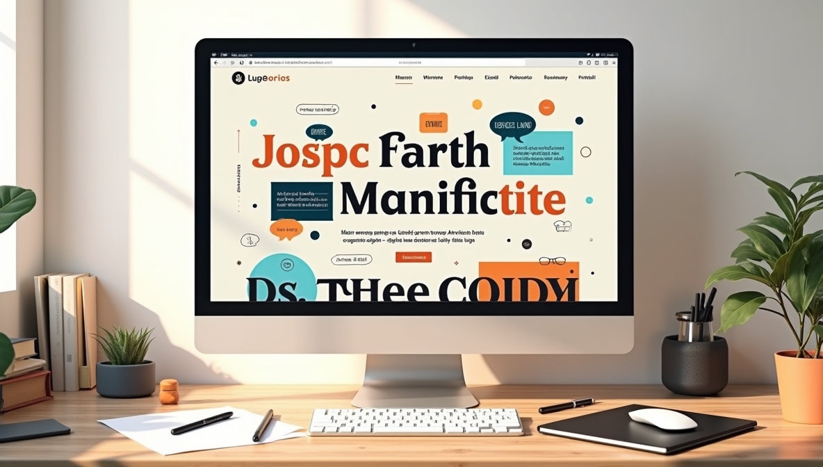
A strong website header and banner need a font that grabs attention, aligns with the brand, and ensures readability. The right choice influences user engagement, trust, and overall site aesthetics. A poor choice, on the other hand, can make the page look unprofessional or difficult to read.
Key Factors to Consider When Selecting a Font
1. Readability Above All
A header font should be easy to read at a glance. Avoid overly decorative or intricate typefaces that sacrifice clarity. Sans-serif fonts such as Montserrat, Poppins, and Open Sans offer excellent readability without unnecessary embellishments. If a serif font suits the brand better, Playfair Display and Merriweather maintain clarity at large sizes.
2. Font Personality and Brand Alignment
Each font conveys a distinct tone. Consider what best represents the brand:
- Modern and Clean: Montserrat, Roboto, Lato
- Elegant and Traditional: Playfair Display, Baskerville, Georgia
- Bold and Impactful: Oswald, Bebas Neue, Anton
- Friendly and Approachable: Poppins, Raleway, Quicksand
The font should reinforce the site’s messaging and design style without conflicting with existing elements.
3. Contrast and Legibility
The font should stand out against the background without straining the eyes. High contrast improves visibility, especially on banners where users only glance for a second. Test different weights and spacing to prevent readability issues.
Best Web-Friendly Fonts for Headers and Banners
Sans-Serif Fonts for a Clean Look
- Montserrat – Balanced and professional, widely used for digital interfaces.
- Oswald – Bold and striking, perfect for large banners.
- Poppins – A geometric sans-serif with smooth edges.
- Roboto – A Google-backed typeface designed for readability on screens.
- Lato – A soft yet solid option with excellent character spacing.
Serif Fonts for a Classic Appeal
- Playfair Display – High contrast with a touch of elegance.
- Merriweather – Designed for readability in digital formats.
- Baskerville – A timeless serif that feels sophisticated.
- Georgia – Well-suited for both print and digital use.
- Cormorant Garamond – A refined alternative with an artistic touch.
Display and Decorative Fonts for Impact
- Bebas Neue – All caps and highly structured.
- Anton – A heavy sans-serif that makes a strong impression.
- Abril Fatface – A bold serif with dramatic contrast.
- Righteous – A stylish geometric typeface for standout headers.
- Pacifico – A script-style font with a casual feel.
Font Pairing for a Cohesive Look
Using two fonts creates contrast and visual hierarchy. The header font should be bold, while the body text remains simple. Effective pairings include:
- Montserrat (Header) + Lora (Body)
- Oswald (Header) + Open Sans (Body)
- Playfair Display (Header) + Roboto (Body)
- Bebas Neue (Header) + Source Sans Pro (Body)
- Anton (Header) + Merriweather (Body)
How PNG Text Overlays Improve Banner Quality
Using PNG images with text overlays ensures crisp, high-quality typography on banners. This method prevents pixelation, maintains clarity on different screen resolutions, and allows designers to fine-tune spacing, shadows, and alignment beyond standard web font rendering.
Technical Considerations for Web Fonts
1. Choose a Web-Safe Format
Fonts should be available in WOFF2 or WOFF formats for browser compatibility. TTF and OTF work but can increase load times.
2. Optimize for Performance
Large font files slow down page speed. Use only the necessary weights and styles. Google Fonts offers an option to select specific variations instead of loading an entire font family.
3. Check Mobile Compatibility
A font that looks great on a desktop may not be as effective on a smaller screen. Test responsiveness to ensure clarity across devices.
4. Avoid Excessive Font Styles
Using too many different fonts creates inconsistency. Stick to one or two typefaces per project to maintain cohesion.
Testing and Adjustments Before Finalizing
- Preview Different Sizes – A header should remain legible at both full-screen and mobile widths.
- Check Color Combinations – Contrast ratios should meet accessibility standards (WCAG guidelines recommend a ratio of at least 4.5:1).
- A/B Test Variations – See which fonts perform best based on user engagement.
Final Thoughts
Selecting the right font for a website’s headers and banners involves balancing readability, aesthetics, and performance. The right choice strengthens brand identity, improves user experience, and keeps visitors engaged. Testing different options ensures that the final selection aligns with the website’s overall design and functionality.
