Not everyone has access to design tools like Illustrator or Photoshop, but that doesn’t mean you can’t build a clean, professional logo. A minimalist, font-based logo is within reach using everyday tools and a sharp sense of balance. If you’re looking to create a logo that’s bold, simple, and recognizable—no design degree or expensive software is required.
Why a Font-Based Logo Works
Font-based logos rely on typography rather than icons or complex shapes. They work because they are:
- Easy to read
- Timeless and adaptable
- Scalable across platforms and sizes
- Quick to produce and update
These logos are often favored by startups, bloggers, and solo creators who want consistency without complication.
Step-by-Step: Create Your Logo Using Fonts
1. Pick the Right Font
The foundation of your logo is the typeface. Think about the vibe you want to convey:
- Serif fonts: Trustworthy, established
- Sans-serif fonts: Modern, clean
- Script fonts: Creative, personal
- Monospace fonts: Tech-focused, structured
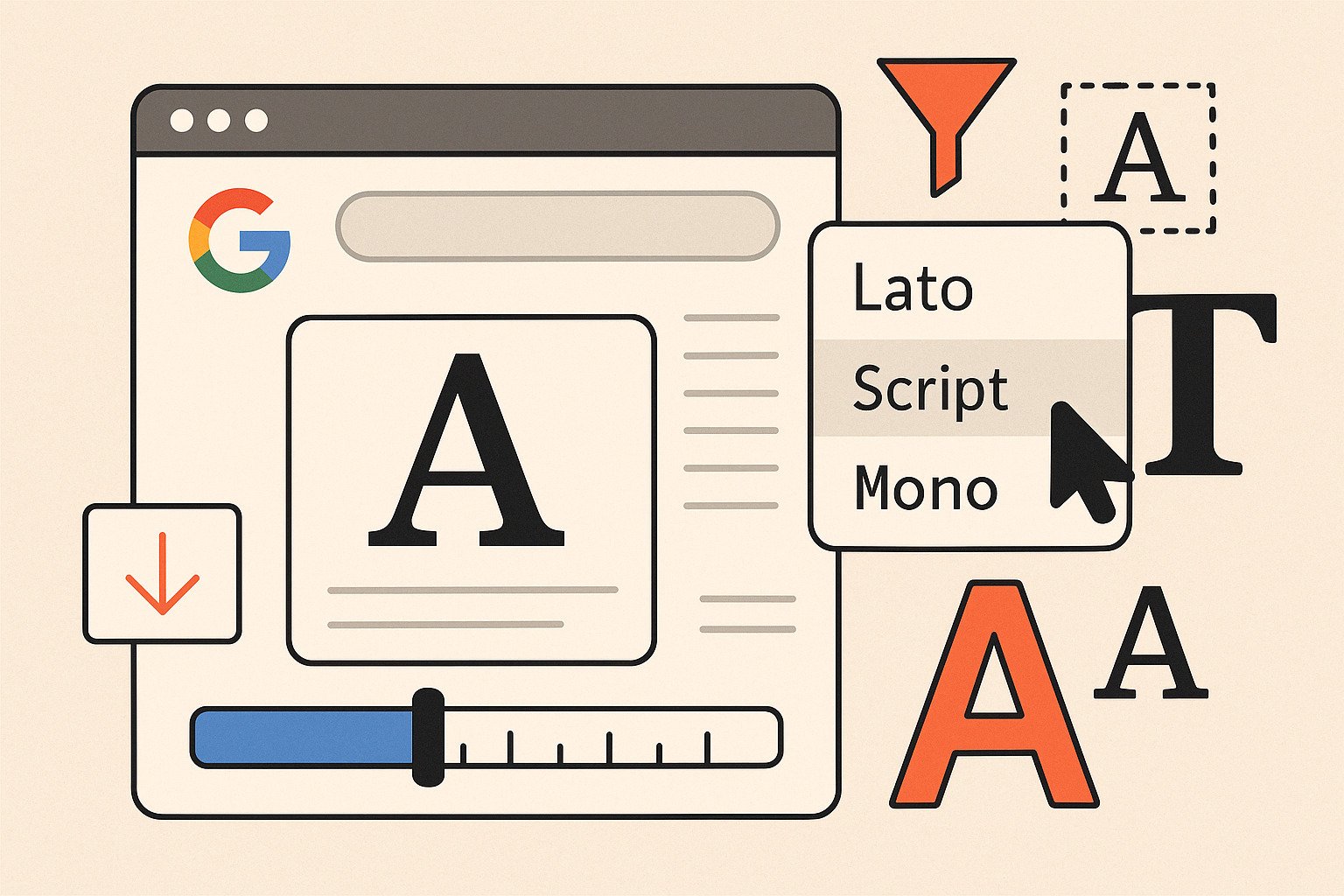
Sites offering font collections let you preview text instantly. Use this to test your brand name in different styles before committing.
2. Choose Your Tool
No need for pro-grade apps. These free and easy options work well:
- Google Docs or Slides: Basic layout and text editing
- Canva: Drag-and-drop interface, font selection
- Figma (free tier): Advanced typography control
- WordMark.it: Preview all fonts installed on your system
You can even build a simple layout in PowerPoint. Adjust kerning (letter spacing), line height, and font weight to fine-tune the look.
3. Decide on Structure and Style
Stick with one or two fonts. Use contrasting styles if combining:
- Bold + Light: Adds visual tension
- All caps vs. lowercase: Changes tone instantly
- Tight or loose spacing: Alters personality
Make sure to test in black and white before color. A solid logo works in monotone first.
4. Color and Contrast
Use high-contrast combinations that don’t blur on small screens:
- Black text on white
- White on deep navy
- Monochrome with accent letters
Avoid gradients or textures at this stage. Flat colors are more versatile for icons, headers, or social profile photos.
5. Export and Test
Once your text is styled and placed, export it as a high-res PNG or SVG (if your tool supports it). Drop it into:
- Your website header
- Social media avatars
- Email signatures
- A favicon generator to produce small browser tab icons
Test for readability at different sizes, especially small-scale. If it’s legible at 16px, you’re on the right track.
Content Focus: Walk Through Creating a Minimalist Logo Using Fonts in Tools
Treat your logo like a system, not just a static graphic. A good font-based logo can be re-applied in multiple ways: as a standalone wordmark, part of a product name, or abbreviated for mobile use. Keep your spacing, alignment, and styling consistent across every application.
Final Tips
- Use grid lines or alignment tools in your chosen platform
- Avoid overly trendy fonts that may date quickly
- Make a black-and-white version before you apply any color
- Save a transparent version for flexible use
Your logo doesn’t need embellishments. Strong type, considered spacing, and clarity carry more impact than gimmicks. Stick to the essentials. Let the typeface do the talking.