Google Fonts is a free and reliable resource offering hundreds of typefaces. It’s easy to access, simple to implement, and trusted by designers, developers, and marketers alike. Whether you’re crafting a website, building a brand, or designing an app, fonts matter. Here’s how to get what you need—and use it well.
How to Get Google Fonts
You don’t need to sign up or install extra tools. Just follow these steps:
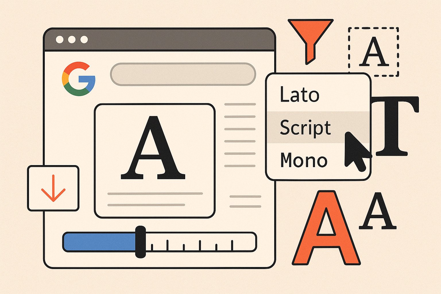
- Visit the Website
Go to fonts.google.com. The homepage displays a gallery of available fonts, each with a live preview and style options. - Use the Filters
Narrow your search by category (serif, sans-serif, display, handwriting, monospace), language, or number of styles. - Preview Text
Type your custom text to see how it looks in different fonts. Adjust weight and size right from the browser. - Select a Font
Click the “+” icon next to a font to select it. A tray will appear at the bottom with an embed code. - Embed or Download
- Embed: Copy the
<link>tag and paste it into the<head>section of your HTML. - Download: Click the download icon to install it locally and use it in design tools like Figma, Sketch, or Photoshop.
- Embed: Copy the
Best Practices for Using Google Fonts
Don’t just add fonts—use them with intention. Here’s how to make them work for your design.
1. Limit Your Font Selection
Too many typefaces create visual clutter. Stick to one or two that contrast well. Use a bold sans-serif for headlines and a legible serif for body text, or vice versa.
2. Pair Fonts Thoughtfully
Pair fonts that complement each other in style, contrast, and mood. A good combo could be:
- Merriweather + Open Sans
- Playfair Display + Roboto
- Lora + Montserrat
Check the Google Fonts pairings page for inspiration.
3. Use Font Weights for Structure
Instead of adding multiple fonts, use different weights (light, regular, medium, bold) of the same family to build hierarchy. This improves load speed and maintains brand consistency.
4. Optimize for Performance
Each additional font or weight increases page load time. Stick to 2–3 weights per font, and use font-display: swap in your CSS to prevent invisible text during loading.
@import url('https://fonts.googleapis.com/css2?family=Roboto:wght@400;700&display=swap');
5. Test Across Devices
Fonts render differently on Mac, Windows, iOS, and Android. Always test across multiple browsers and screen sizes before finalizing your typography.
6. Mind the Licensing
All Google Fonts are open source. You can use them for commercial and personal projects without worrying about licensing restrictions.
Fonts Worth Trying Right Now
These popular fonts balance readability and personality:
- Inter – clean, versatile, built for screens
- Poppins – geometric with a modern feel
- Lato – warm and friendly, suitable for body text
- Roboto Slab – great for headlines
- Source Sans Pro – excellent for apps and interfaces
Tools to Help You Work Faster
- FontPair.co – curated font pairings
- Fontjoy.com – AI-based generator for font combos
- TypeScale.com – visual calculator for modular scales
Mastering Google Fonts doesn’t require a toolkit of tricks—just smart selection, clean pairing, and performance awareness. Get the right font, load it the right way, and let your design speak clearly.